
Choosing a paint color based on a small swatch is the most common reason a kitchen feels disjointed. Most homeowners realize too late that a chosen “off-white” looks pink or muddy once it is applied to a large surface. The fear of making a permanent, expensive mistake is a logical response to the complexity of undertones and shifting light. Mastering the technical art of coordinating cabinet paint with wall color is the only way to ensure your project results in a cohesive, high-end aesthetic.
You likely want a kitchen that feels intentional and increases your home’s overall value. This guide provides professional-grade contrast strategies and light management techniques to help you finalize a palette with confidence. We examine how to identify hidden undertones and how to calculate light reflectance values. You will learn the specific steps required to achieve a designer look through precise color coordination. These principles apply whether you’re focusing on Kitchen Cabinet Painting or updating your bathroom cabinet painting. By following this procedural approach, you can eliminate the guesswork and create a space that maintains its visual appeal in any lighting condition.
Key Takeaways
- Learn how Light Reflectance Value (LRV) and surface undertones dictate whether your kitchen feels spacious or cramped.
- Master the technical process of coordinating cabinet paint with wall color using monochromatic or complementary design strategies.
- Identify the “boss” colors in your countertops and flooring to ensure your new paint palette harmonizes with existing architectural features.
- Follow a structured five-step selection process to eliminate guesswork and avoid common mistakes when selecting permanent finishes.
- Understand how a professional finish enhances color perception by removing the shadows and textures common in DIY applications.
Understanding the Fundamentals of Color Coordination
Successful kitchen design depends on technical calculations rather than subjective preference. When you begin coordinating cabinet paint with wall color, you must treat the cabinetry as the architectural anchor of the room. Cabinets occupy the majority of the vertical surface area; therefore, their color dictates how light travels through the space. This process requires a basic understanding of a guide to color theory to ensure that the relationship between fixed surfaces and painted finishes remains balanced. If the cabinet color is chosen in isolation, the walls often appear dingy or yellow by comparison.
To better understand how specific colors function in a kitchen environment, watch this helpful overview:
The Science of LRV in Kitchen Design
Light Reflectance Value (LRV) measures the percentage of light a color reflects. On a scale of 0 to 100, absolute black is 0 and pure white is 100. Professional designers use this metric to manage the “contrast gap” between surfaces. If your cabinet and wall colors are within 5 points of each other, the room often looks accidental or muddy. This lack of distinction fails to define the architectural lines of the cabinetry.
A minimum 10-point LRV difference is the professional standard for visible contrast. This gap ensures that the cabinets stand out from the walls without looking clinical. For example, if you choose a cabinet color with an LRV of 80, your wall color should ideally sit at 70 or below. This strategy prevents the washed-out look common in poorly planned white-on-white kitchens. Identifying undertones is equally critical. If your cabinets have a green undertone and your walls have a pink undertone, the surfaces will clash. Harmony is achieved when these undertones share a common base.
The Denver Light Factor
In Colorado, the environment plays a distinct role in how paint appears. Denver’s 300+ days of sunshine and high-altitude UV rays significantly intensify color saturation. Cool blue and gray undertones often look much sharper and icier here than they do at sea level. The thinner atmosphere allows more direct light into the home, which can expose hidden undertones that might remain hidden in more overcast climates.
The direction of your windows also changes the requirements for coordinating cabinet paint with wall color. Consider these lighting conditions:
- North-facing kitchens: These rooms receive cool, bluish light. This light can make creamy whites look dingy or overly yellow.
- South-facing kitchens: These spaces receive warm, intense light all day. This can turn a neutral greige into a muddy tan or make dark colors look flat.
You should select colors that remain stable under both this intense natural light and the specific Kelvin temperature of your LED bulbs. Testing samples in the actual room is non-negotiable. Denver’s light is uniquely aggressive, and colors that look perfect in a showroom often shift dramatically once applied to your cabinets.
Three Professional Strategies for Coordinating Cabinets and Walls
Selecting a framework for coordinating cabinet paint with wall color depends on the architectural scale of the kitchen and the desired level of visual energy. Professional designers do not choose colors in isolation. They often apply the 60-30-10 rule to balance dominant and secondary hues. This standard dictates that 60% of the room’s color comes from the walls, 30% from the cabinetry, and 10% from accents like hardware or decor. Deviating from a structured strategy often leads to a cluttered or unbalanced appearance.
The Monochromatic and Tonal Look
A monochromatic approach uses the same hue for both cabinets and walls, which is a highly effective strategy for smaller kitchens. By removing the visual break between the vertical surfaces, the room appears more expansive and seamless. This creates a “built-in” furniture feel that emphasizes the room’s shape rather than individual components. To prevent the space from looking flat, you should vary the sheen levels. Applying a Satin or Semi-Gloss finish for professional Kitchen Cabinet Painting against an Eggshell wall provides a subtle texture contrast. This difference in light reflection ensures the cabinets remain distinct without requiring a change in color.
Complementary and Two-Tone Designs
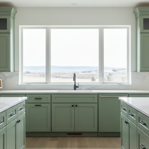
Complementary strategies utilize the color wheel to find natural pairings that provide visual interest. A prominent trend for 2026 involves “Tuxedo” cabinets, where upper and lower units feature different colors. Using a deep, grounded color like navy or forest green on the lower cabinets anchors the room, while keeping the upper cabinets and walls in a warm neutral like cream or mushroom maintains an airy feel. This strategy allows you to experiment with bold colors without overwhelming the space. If the kitchen includes an island, the “Island Accent” rule applies. The island serves as the focal point and can feature a third, more saturated color that complements the surrounding palette.
Many traditional Denver homes contain original wood elements that must be integrated into the new design. Successful coordination requires identifying the wood’s primary undertone. Warm oak or walnut surfaces pair well with cool-toned walls to create a balanced environment. When you are coordinating cabinet paint with wall color in these settings, the goal is to neutralize the “orange” or “yellow” cast of the wood. Selecting a wall color with a slight green or blue base provides the necessary contrast to make the wood grain appear intentional and modern. This procedural approach ensures the final result looks cohesive rather than accidental.
Accounting for Fixed Elements: Countertops and Flooring
While paint is easily adjusted, countertops and flooring are fixed architectural elements that dictate the boundaries of your palette. These surfaces act as the visual bridge between your cabinetry and your walls. If you ignore these elements when coordinating cabinet paint with wall color, the final result will likely feel discordant or unfinished. You must identify the dominant undertone in your stone and wood before selecting any paint samples for your project.
Extracting Undertones from Stone
Granite, quartz, and marble slabs contain what designers call the “boss” color. This is the primary undertone that governs how other colors react in the space. Many homeowners make the mistake of matching cabinet paint to the overall background color of a stone slab. This often results in a flat, uninspired look. Instead, you should identify the subtle flecks or veining within the stone. If your quartz has faint gray-blue veins, a cabinet color with a similar cool base will create a more intentional connection than a generic white.
Avoiding a clash between warm stone and cool wall paint is a requirement for a professional finish. For example, a beige-heavy granite slab will make cool, blue-toned walls look icy and detached. Conversely, a crisp white wall can make a cream-toned countertop look dirty. Analyzing these surfaces under the specific lighting conditions mentioned in previous sections is a critical step in the procedural selection of your palette.
Flooring as the Room’s Foundation
Your flooring provides the literal foundation for the kitchen’s color story. Current 2026 trends show a move away from cool grays toward warmer, nature-inspired hues like walnut and white oak. If your home features these natural wood finishes, your wall and cabinet colors must respect that warmth. Choosing a cold, clinical gray for the walls often fails in these environments because the gray appears blue against the wood, creating a high-energy clash that lacks sophistication.
When you are coordinating cabinet paint with wall color, consider the relationship between floor depth and cabinet weight. Dark espresso floors often require lighter cabinet finishes to prevent the room from feeling cave-like. If you have tile flooring, the grout lines add a grid-like visual pattern that can complicate the design. A backsplash with high-contrast grout further adds to this visual noise. To maintain a cohesive look, keep your paint colors within a tighter LRV range if your floors or backsplashes are highly patterned. This maintains focus on the cabinetry, which remains the anchor of your cabinet refinishing project.

A 5-Step Selection Process for a Cohesive Kitchen
A structured decision-making framework prevents the color discord often seen in DIY projects. Coordinating cabinet paint with wall color requires a procedural approach that accounts for environmental variables rather than relying on guesswork. Following a specific sequence ensures that the final palette remains stable under different lighting conditions and architectural constraints. This process eliminates the common error of selecting colors in isolation.
In addition to these steps, many contractors now use digital tools to help clients preview changes; you can learn more about ArchKit Design to see how augmented reality is used by design professionals to visualize these complex color relationships in real-time.
- Step 1: Identify fixed elements. Audit your countertops, flooring, and backsplash to determine the “boss” undertone that will govern the room.
- Step 2: Narrow the cabinet color. Select your primary cabinetry hue based on the desired contrast gap and Light Reflectance Value (LRV) discussed in previous sections.
- Step 3: Select wall candidates. Choose 3-5 wall colors that share the same base undertone as your cabinet selection to ensure harmony.
- Step 4: Conduct physical sampling. Place large-scale samples in the actual room environment rather than relying on showroom displays.
- Step 5: Review temporally. Observe how the colors shift from the bright morning sun to the warm glow of evening LED lighting.
The Importance of Large-Scale Sampling
Standard 2-inch paint chips are insufficient for a kitchen cabinet painting project. These small swatches don’t provide enough surface area to demonstrate how a color reacts to the shadows created by cabinet doors and drawer fronts. You must use large-scale samples, ideally 12×12 inches or larger, and place them on both vertical and horizontal planes. Vertical samples simulate the cabinetry, while horizontal samples show how the color interacts with the countertop. Always test your samples in the darkest corner of the kitchen. This step ensures the color doesn’t lose its character or turn muddy in low-light areas.
Finalizing the Palette
The “White Paper Test” is a requirement for identifying true undertones. Place your chosen paint sample against a sheet of pure white printer paper. This contrast reveals hidden pink, green, or blue hues that are otherwise invisible to the naked eye. Additionally, you must ensure your kitchen palette flows into adjoining living spaces. A kitchen does not exist in a vacuum; the color coordination must remain cohesive with the rest of your home’s interior. Before finalizing your choice, consult with a professional cabinet painter for final color verification. They can confirm if the specific pigments in your chosen color are compatible with high-performance finishes. If you are ready to move forward, you can request a technical color assessment to verify your selections.
The Impact of Professional Finishing on Color Perception
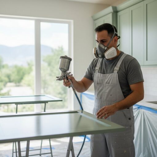
The success of coordinating cabinet paint with wall color is often determined by the physical texture of the application. While homeowners focus on the pigment, the method of application dictates how light interacts with that pigment. A factory-grade spray finish provides a perfectly level surface that reflects light uniformly. In contrast, DIY methods often introduce surface irregularities that distort the intended hue. Achieving a professional result requires an understanding of how texture influences color depth and clarity.
Texture and Light Reflection
Hand-applied paint inevitably leaves brush marks and roller stipple. These textures create “micro-shadows” across the surface of the cabinetry. These shadows make the color appear several shades darker and muddier than the original swatch. When you are coordinating cabinet paint with wall color, these unintended shadows can ruin the calculated contrast gap you established during the selection process. A professional spray finish eliminates these shadows, providing the clean, architectural finish required for a high-end kitchen.
Local environmental factors also influence the final appearance. Cabinet painting in Denver requires specific adjustments for the region’s low humidity. If paint dries too quickly due to the dry Colorado air, it can “orange peel” or fail to level properly, creating a bumpy texture that catches light awkwardly. Professional technicians monitor these conditions to ensure the coating lays flat, maintaining the integrity of the color you selected.
Durability and Long-Term Color Stability
The high-altitude UV exposure in Colorado is a primary cause of color shifting over time. Standard retail paints often lack the industrial-grade UV inhibitors found in professional coatings. Without these protectors, a carefully coordinated palette can drift within 24 months, with cabinets fading at a different rate than the walls. Professional cabinet refinishing utilizes high-performance primers and topcoats that block tannins from bleeding through the wood. This prevents white cabinets from turning yellow or amber over time.
Sheen selection is the final technical variable. A Matte finish absorbs light and makes colors look more saturated and “true,” while a Semi-Gloss finish reflects more light, often making the color appear lighter. Professional preparation ensures that the substrate is completely neutralized before the first coat is applied. This procedural rigor ensures that the color you pick is the color that remains on your cabinets for years to come. By prioritizing a smooth, factory-grade finish, you protect the investment made in your kitchen’s design and home value.
Finalizing Your Kitchen Transformation
Mastering the technical aspects of color coordination ensures your kitchen remains a cohesive, high-value space. Light Reflectance Value and undertones aren’t just suggestions; they’re the foundation of a balanced room. You must also account for fixed elements like stone countertops and hardwood floors to prevent visual clashing. Achieving a designer look requires precision when coordinating cabinet paint with wall color. This procedural approach eliminates the risk of expensive mistakes.
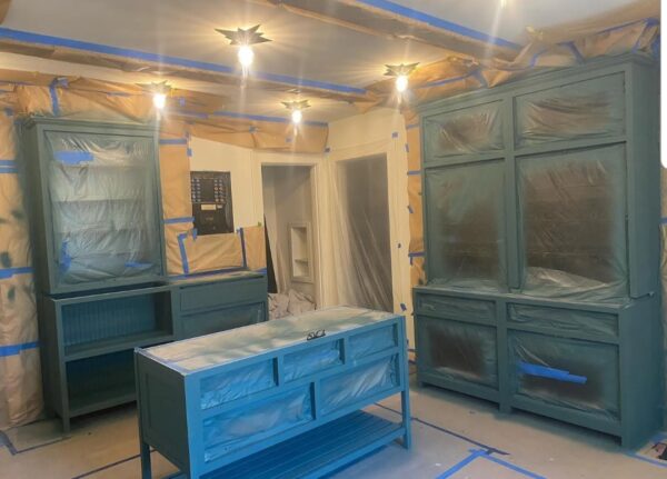
A professional application is the final requirement for success. Our team utilizes a professional off-site spray booth to deliver factory-quality finishes that eliminate the micro-shadows caused by brush marks. We specialize in kitchen transformations across the Denver metro area. We include an expert color consultation with every project to verify your specific palette choices under local lighting conditions. Get Your Free Cabinet Painting Quote in Denver to begin your project today. With a structured strategy and a flawless finish, your kitchen will become the most inviting and intentional room in your home.
Frequently Asked Questions
Should kitchen cabinets be lighter or darker than the walls?
The decision depends on the desired visual weight of the room. Darker cabinets anchor the space and provide a grounded, sophisticated look, while lighter cabinets make a kitchen feel more expansive and airy. The technical requirement is to maintain a visible contrast gap of at least 10 LRV points to ensure the surfaces don’t look like an accidental mismatch.
What color wall goes best with white kitchen cabinets?
Soft neutrals such as greige, mushroom, or muted sage provide a sophisticated backdrop for white cabinetry. You should avoid using a stark, pure white on the walls, as this often makes the cabinets appear yellow or dingy by comparison. Selecting a wall color with a slightly warmer undertone creates a welcoming and intentional environment.
How do I choose a wall color if I have two-tone cabinets?
You should generally coordinate the wall color with the upper cabinets to maintain a sense of height and openness. If your upper cabinets are white and the lowers are a dark navy, a light neutral wall keeps the space from feeling top-heavy. This strategy allows the darker lower cabinets to act as a grounded architectural feature without overwhelming the room’s lighting.
Does the cabinet paint sheen need to match the wall paint sheen?
Cabinet and wall sheens shouldn’t match. Cabinets require the durability of a Satin or Semi-Gloss finish to withstand frequent cleaning and moisture. Walls are typically finished in Eggshell or Matte to hide imperfections and provide a soft contrast to the harder, more reflective surfaces of the cabinetry. This difference in sheen adds necessary depth to the kitchen design.
Can I match my cabinet color exactly to my wall color?
Matching the colors exactly is a professional strategy known as the monochromatic approach. This technique is highly effective when coordinating cabinet paint with wall color in smaller kitchens because it removes visual boundaries and makes the room feel larger. To ensure the room doesn’t look flat, use a Satin finish on the cabinets and an Eggshell finish on the walls.
How does the Denver altitude affect how paint colors look?
Denver’s high altitude and thin atmosphere increase UV intensity, which makes cool undertones like blue and gray look much sharper and more vibrant. This intense sunlight can also wash out mid-tone colors, making them appear lighter than they do on a swatch. It’s a requirement to view your color samples in the actual room to account for these local atmospheric conditions.
What are the most popular cabinet and wall color combinations for 2026?
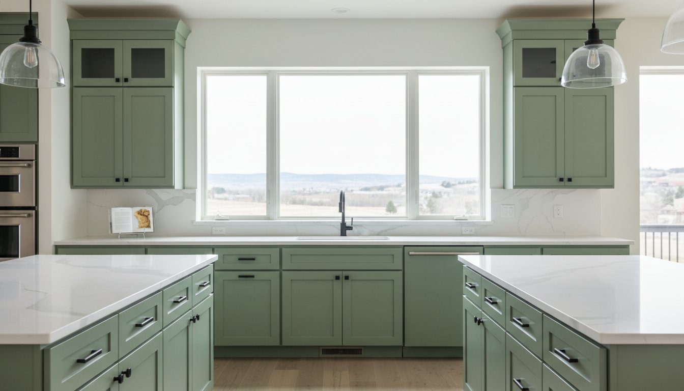
Current trends for 2026 prioritize nature-inspired palettes such as dusty sage cabinets paired with creamy off-white walls. Another popular combination involves rich terracotta or mushroom-gray cabinets against warm beige walls. These pairings move away from the cool grays of the past decade toward a more inviting and earthy aesthetic that feels grounded and timeless.
How do I coordinate my cabinets with a busy granite countertop?
Identify the “boss” color within the countertop’s veining and use that as your cabinet color. If your granite features small flecks of charcoal or warm taupe, selecting one of those hues for your cabinetry creates a cohesive look. When coordinating cabinet paint with wall color in these spaces, keep the wall paint neutral and simple to avoid competing with the movement in the stone.