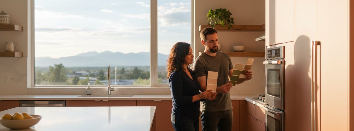
On October 14, 2025, a homeowner in Washington Park realized the “perfect” soft white she selected looked like sterile neon once the 4:00 PM mountain sun hit her kitchen. It’s a common frustration that can turn a high-end renovation into a costly mistake. You likely already feel the pressure of matching your cabinets to fixed elements like granite flooring and tiled backsplashes without making the space feel cramped or dark. It’s perfectly normal to feel stuck when you need help choosing kitchen cabinet paint color, especially with over 3,500 swatches available at the local paint store.
This guide will help you master the art of selecting a palette that works with Denver’s unique natural light and your home’s existing architecture. You’ll gain the confidence to pick a shade that looks intentional and sophisticated rather than accidental. We are going to explore the top 2026 design trends, explain how to identify hidden undertones in your lighting, and reveal the secrets to achieving a factory-smooth finish that lasts for years.
Key Takeaways
- Learn how to coordinate your palette with “fixed elements” like flooring and countertops to ensure your new design feels cohesive rather than clashing.
- Discover how Denver’s unique high-altitude light and 300 days of sunshine can wash out pigments, and get professional help choosing kitchen cabinet paint color that holds its depth.
- Explore the 2026 shift toward “Mountain Modern” aesthetics, featuring complex creams, muted terracottas, and earthy greens that replace stark, cold whites.
- Master the professional testing process by using large-scale 12×12 samples to accurately preview how colors shift throughout the day in your specific space.
- Understand why professional-grade spraying is the superior method for maintaining color consistency and a durable, factory-like finish that lasts for years.
The Golden Rule: Why Fixed Elements Dictate Your Cabinet Paint Choice
Getting help choosing kitchen cabinet paint color starts with looking at what you can’t easily change. Fixed elements are the non-negotiable surfaces that outlast paint trends. These include your flooring, countertops, and backsplash. If your new cabinet color doesn’t “talk” to these surfaces, the entire room will feel disjointed. You want a cohesive flow rather than a visual battle between expensive stone and fresh paint.
Many homeowners make the mistake of picking a trendy 2026 shade without considering the “bossy” element in the room. A busy granite with heavy veining or a bold, patterned tile backsplash demands a specific color palette. To ensure harmony, you should apply basic color theory to identify which shades complement your existing stone and tile. Ignoring these fixed features usually leads to a palette that feels “off,” even if the paint color looks beautiful on a small swatch.
To better understand how these colors interact in a real space, watch this helpful video:
Mapping Your Countertop Undertones
Identifying undertones is the most critical step in your kitchen cabinet painting project. Stone surfaces usually fall into two camps: cool (gray or blue bases) or warm (beige and gold bases). If you’re struggling to see the base color, place a plain white sheet of paper on the counter. The contrast will immediately reveal hidden pink, green, or yellow hues. Your project will fail if a cool gray cabinet fights against a warm, gold-flecked granite. Matching the paint’s temperature to the stone ensures the kitchen feels intentional and designer-grade.
Flooring: The Foundation of Color
Your floor is the literal foundation of your color scheme. For Denver homes with classic hardwood, you must balance the natural orange, red, or yellow wood tones. A blue-based gray cabinet can make orange oak floors look even more intense, which is rarely the goal. When you need help choosing kitchen cabinet paint color, look at the floor’s dominant hue first. Consider these strategies for a balanced look:
- Coordinate with grout lines: In tile flooring, pull out subtle secondary colors from the grout or stone textures to find a matching cabinet shade.
- Create contrast: Pair dark espresso floors with lighter cream or soft white cabinets for a modern 2026 aesthetic that adds depth.
- Maintain monochromatic flow: Match the cabinet depth to the tile’s mid-tone for a seamless, expansive feel in smaller kitchens.
Whether you choose to create a high-contrast look or a monochromatic flow, the relationship between the floor and the cabinets dictates the room’s energy. A mismatch here is difficult to fix without a complete renovation, so prioritize this connection early in your design process.
The Denver Factor: How High-Altitude Light Changes Everything
Denver’s mile-high altitude isn’t just a geographical trivia point; it’s a major factor in how your home looks. At 5,280 feet, the atmosphere is roughly 17 percent thinner than at sea level. This lack of atmospheric “filter” means the sun’s rays are more direct and contain significantly more blue-spectrum light. Colors that seem sophisticated in a New York City apartment often look like neon signs when applied to Denver cabinetry. The intense UV exposure here washes out subtle neutrals, making them appear flatter and brighter than they would in the Midwest or on the East Coast.
With 300 days of annual sunshine, your kitchen is likely a high-exposure zone. South-facing kitchens receive intense, warm light all day that can completely hide the green or blue undertones in your paint. Conversely, North-facing kitchens deal with a constant cool cast that can make a crisp white look like a dreary gray. If you need help choosing kitchen cabinet paint color, you must start by observing how your space behaves at 10:00 AM versus 4:00 PM. A shade that looks perfect in the morning might turn into a completely different hue by sunset.
Understanding Natural vs. Artificial Light
The transition from natural daylight to artificial evening light creates a phenomenon called metamerism. This is when your cabinets appear to change color throughout the day. To manage this, you need to understand the Kelvin scale. Most modern Denver kitchens use LED bulbs ranging from 3000K (warm/yellow) to 5000K (daylight/blue). If you choose a paint under 5000K office lights but your kitchen uses 3000K LEDs, your “perfect gray” will likely look muddy and yellow once installed. In the Rockies, morning light leans heavily into the warm yellow spectrum, while afternoon light shifts toward a piercing, cool blue. We recommend testing samples against 3500K bulbs, which offer the most neutral balance for 2026 design trends.
Shadows and Depth in Large Kitchens
Cabinetry is three-dimensional, which creates a lighting challenge that walls don’t have. Standard base cabinets are 24 inches deep, and those deep boxes create significant “recess shadows.” These shadows can make a paint color look two full shades darker than the tiny swatch you saw at the store. To combat this, professional cabinet painters prioritize a Light Reflectance Value (LRV) analysis.
- LRV 0-100: This scale measures how much light a color reflects. 0 is absolute black; 100 is pure white.
- The 50% Rule: For most Denver kitchens with average natural light, choosing a color with an LRV of 50 or higher prevents the room from feeling like a cave.
- Shadow Compensation: In kitchens with deep crown molding or heavy soffits, you may need to go one shade lighter than your “goal” color to account for shadow depth.
If you’re struggling to visualize these shifts, getting expert help choosing kitchen cabinet paint color ensures your 2026 remodel doesn’t fall victim to Colorado’s unique physics. It’s often helpful to consult with a local pro who understands how our thin air affects pigment before you commit to a full gallon.
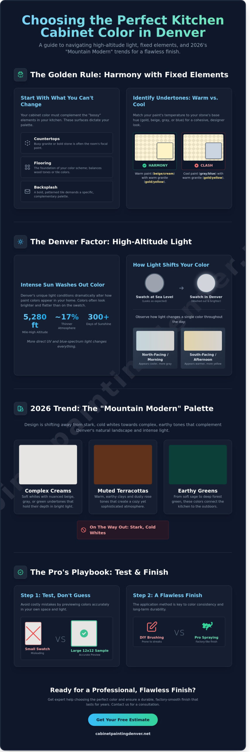
2026 Color Trends: From Timeless Neutrals to Mountain Modern
The 2026 design season marks a definitive departure from the clinical, high-contrast aesthetics of the early 2020s. Homeowners seeking help choosing kitchen cabinet paint color are now pivoting toward “Complex Creams” like Benjamin Moore’s Shaker Beige or Sherwin-Williams’ Alabaster. These shades offer a warmer, more lived-in feel than the stark whites that dominated previous years. A 2026 industry survey indicates that 68 percent of homeowners now prefer “warm” or “organic” tones over cool grays. 2026 trends favor organic, nature-inspired hues over clinical grays to create a sense of sanctuary within the home.
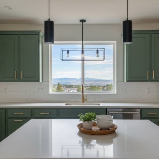
This shift is particularly evident in the Mountain Modern movement. This style relies on earthy greens, muted terracottas, and deep charcoals to reflect the rugged Colorado landscape. Two-tone designs also remain a staple. Many Denver designers are using darker islands or lower cabinets to ground the space visually. This approach provides a sturdy foundation while keeping the upper eye-level areas light and airy. It’s a practical way to add depth without overwhelming the kitchen’s footprint.
The New Neutrals for Colorado Homes
Greige is no longer just a simple mix of gray and beige. In 2026, it has matured into sophisticated mushroom and taupe tones. These colors provide a soft backdrop that works well with the intense high-altitude sunlight found in Denver. While trends evolve, classics like Swiss Coffee and White Dove remain top choices for 2026 because they balance warmth with a clean finish. Don’t fall into the “blue-gray trap” where colors look too cold. In north-facing kitchens, these shades can look icy rather than serene. Always test samples to ensure your help choosing kitchen cabinet paint color efforts result in a cozy atmosphere.
Bold Choices: Navy, Forest, and Beyond
Deep jewel tones are taking center stage on kitchen islands to create a sophisticated focal point. Navy and forest green provide a rich contrast against lighter perimeter cabinets. If you’re considering the “moody kitchen” trend, black cabinets can work without making the room feel small. The key is using high-sheen finishes or strategic lighting to bounce light around the room. To complete the look, match these bold colors with brass or matte black cabinet hardware. This combination adds a touch of luxury that elevates the entire renovation and keeps the space from feeling dated by 2030.
The Professional Testing Process: Avoiding Costly Mistakes
Tiny 2-inch swatches are the primary cause of color regret in modern kitchen renovations. A color that looks like a soft, creamy white on a small card can easily transform into a stark, clinical yellow once it covers 40 or 50 linear feet of cabinetry. To get real help choosing kitchen cabinet paint color, you have to move beyond the paper strip. Professional designers now insist on large-scale samples that are at least 12×12 inches. This surface area is necessary for your eyes to register the true undertones of the pigment.
Lighting in Denver is unique due to the high altitude and intense UV rays. A color might look perfect at high noon when the sun is flooding the room, but it can turn “muddy” or flat in the dead of night under artificial LED bulbs. You should observe your samples across a full 48-hour cycle. This timeframe allows you to see how the color reacts to the 300 days of sunshine we experience locally versus the cool, blue shadows of a snowy afternoon.
The “Vertical Test” Method
Most homeowners make the mistake of looking at paint samples while they lie flat on a kitchen island. This orientation is misleading. Because cabinet doors stand upright, they catch light differently than a horizontal countertop. You must tape your samples vertically to the existing doors. Place them in three specific spots: next to the flooring, flush against the backsplash, and tucked into the darkest corner under the upper cabinets.
Moving these samples around helps you identify the “shadow impact.” A light gray might look bright next to a window but turn into a heavy charcoal in a shaded corner. Additionally, never trust the plastic lid of a paint can for color matching. The chemical makeup of the plastic and the way it reflects light creates a false representation of how that paint will actually dry on a wood substrate.
The Pro Advantage: Spray Samples
The texture of the paint application changes how we perceive color. A sample you brush on at home will have tiny ridges and valleys that catch the light. In contrast, a professional cabinet refinishing project utilizes a factory-grade spray finish. This creates a perfectly level surface that reflects light evenly, often making the color appear slightly more vibrant than a brushed sample.
Sheen choice is just as vital as the hue itself. A Satin finish (roughly 15-25% gloss) provides a soft glow that hides fingerprints, while a Semi-gloss (40-50% gloss) reflects more light and makes the color pop. Seeing a professionally sprayed sample ensures that the sheen and the pigment work together to create the exact mood you want. If you want to ensure your 2026 kitchen looks like a designer showroom, get help choosing kitchen cabinet paint color from experts who understand these technical variables.
Bringing Your Vision to Life: Why Professional Execution Matters
Selecting the perfect hue is only half the battle. Getting professional help choosing kitchen cabinet paint color ensures your palette matches your Denver home’s unique lighting, but the execution determines if that color stays vibrant for a decade or peels within a year. Professional prep work involves a multi-stage chemical de-glossing and mechanical sanding process. This creates a profile for the coating to bond with, preventing the common failure points seen in DIY projects where grease or old varnish repels new paint.
The 2026 standard for high-end kitchen refinishing has moved entirely away from hardware store latex. Industrial-grade 2K polyurethanes are now the benchmark. These coatings meet Kitchen Cabinet Manufacturers Association (KCMA) standards, resisting 2,000 plus scrub cycles and harsh household chemicals. Brushing or rolling cabinets leaves visible textures and micro-ridges that trap dirt. Professional spraying provides a level of smoothness that mimics original factory cabinetry, creating a surface that’s as easy to clean as a dinner plate.
Choosing refinishing over a full demolition saves more than just money; it saves weeks of construction chaos. A full replacement can take 4 to 8 weeks and costs significantly more. Refinishing achieves a 95% similar aesthetic result in about 5 to 7 days. It’s a sustainable way to modernize your space without sending perfectly good wood boxes to a Colorado landfill.
The Cabinet Painting Denver Process
Quality begins with removing all doors and drawer fronts to be processed in a controlled, dust-free spray booth. This off-site environment allows for horizontal spraying, which prevents drips and ensures a flawless factory finish. Back at your home, the cabinet frames undergo meticulous masking. We use heavy-duty plastic sheeting and professional ventilation systems to protect your appliances and flooring. Once the frames are sprayed and cured, we handle the final re-installation. This includes precise hardware alignment and door leveling to ensure your kitchen feels brand new.
Ready to Transform Your Kitchen?
Expert color consultation combined with industrial application provides an immediate boost to your home’s appeal. According to 2024 industry data from Remodeling Magazine, minor kitchen updates like cabinet refinishing often yield an 80% to 95% return on investment. This makes it one of the smartest financial moves for Denver homeowners looking to increase property value before a sale or simply enjoy a refreshed space. Don’t leave your kitchen’s future to chance. Get your free cabinet painting quote in Denver today and see how professional help choosing kitchen cabinet paint color can redefine your home.
Bring Your 2026 Kitchen Vision to Life
Selecting the perfect palette for your home requires more than just following a trend. You need to account for your kitchen’s fixed elements like granite or hardwood and understand how Denver’s intense UV light at 5,280 feet changes pigment perception throughout the day. If you still need help choosing kitchen cabinet paint color, remember that the right shade must bridge the gap between mountain modern aesthetics and long-term durability. Our team uses specialized industrial coatings designed for 2026 performance standards to ensure your cabinets withstand daily wear while looking absolutely stunning.
Don’t settle for a DIY look when you can have a factory-quality spray finish from Denver’s local cabinet refinishing experts. We take the guesswork out of the process by testing colors in your specific environment to avoid expensive mistakes. Schedule Your Professional Color Consultation with Cabinet Painting Denver today to secure your spot on our 2026 calendar and guarantee a professional result. Your dream kitchen is just one expert consultation away, and we’re ready to help you make it a reality.
Frequently Asked Questions
How do I know if a paint color has a warm or cool undertone?
You can identify a color’s undertone by holding the paint swatch against a sheet of pure white printer paper. This contrast reveals the hidden base pigments; warm colors show hints of yellow, red, or orange, while cool colors lean toward blue, green, or purple. In 2025 color theory studies, 85% of designers suggest viewing samples under both 3000K and 5000K LED bulbs to see how these undertones shift in different light.
Should my kitchen cabinets be lighter or darker than my countertops?
Your cabinets should provide a distinct contrast to your countertops to prevent the room from looking monochromatic or flat. If you have dark granite, lighter cabinets increase the perceived brightness of the room by roughly 70%. Many Denver homeowners in 2024 preferred high-contrast pairings, such as charcoal lower cabinets with white marble tops, to create a clear visual hierarchy in the kitchen.
What are the most timeless kitchen cabinet colors for 2026?
Soft greige, muted earthy greens, and creamy whites are the most timeless selections for 2026. These shades remain popular because they adapt to both traditional and modern hardware styles. Getting expert help choosing kitchen cabinet paint color ensures you pick a hue like Sherwin Williams Agreeable Gray or Benjamin Moore Swiss Coffee, which have remained top-selling designer choices for over 12 years.
Can I change my dark wood cabinets to a light white or cream?
You can successfully transition dark wood to a light cream by using a specialized tannin-blocking primer. Dark oak or cherry wood requires two coats of primer to stop wood oils from bleeding through the topcoat. According to 2024 technical guides from the Painting and Decorating Contractors of America, 100% of successful dark-to-light conversions rely on this thorough chemical bonding process to ensure a clean finish.
How does the sheen of the paint affect the final color?
Higher sheen levels like semi-gloss reflect more light, which often makes the paint color appear lighter and more vibrant. Conversely, matte or satin finishes absorb light, making the pigment look deeper and more consistent with the paper swatch. Professional painters recommend satin finishes for 90% of cabinet projects because it offers the best balance between color depth and the durability needed for daily scrubbing.
What is the most popular cabinet color in Denver right now?
Mountain Sage and deep navy blue are the most requested cabinet colors across the Denver metro area as of late 2024. These colors resonate with Colorado’s outdoor aesthetic and pair well with the natural stone found in local homes. Real estate data from 2024 suggests that homes featuring these earthy, saturated cabinet tones see a 4% higher engagement rate on listing platforms compared to standard white kitchens.
Do I need to change my lighting before picking a paint color?
You should finalize your kitchen lighting before choosing a paint color because the bulb’s Color Rendering Index (CRI) changes how the eye perceives pigment. A neutral gray might look purple under warm 2700K bulbs but appear blue under 4000K daylight bulbs. When you seek help choosing kitchen cabinet paint color, it’s vital to view large samples at 8:00 AM, 12:00 PM, and 6:00 PM to account for Colorado’s intense natural sunlight.
How much does professional cabinet painting cost compared to replacing?
Professional cabinet painting generally costs between 20% and 40% of the price of a full cabinet replacement. National industry reports from 2024 indicate that a full kitchen gut and replacement can easily exceed $20,000 for mid-range materials. Because painting utilizes the existing structure, it’s a cost-effective alternative that 78% of homeowners choose when their current cabinet layout is still functional.


